Printdesigns offer a full in-house graphic design service for the creation of artwork for many of our products including roller banner stands and pop up stands. It is also possible to supply your own print files to us should you wish to design your own artwork.
When setting artwork, there are many factors to consider in order to create a professional, good looking design but this short post is to do with the basics of using the correct colour mode.
There are several commonly used colour palettes available when designing artwork including RBG (red, green, blue), CMYK (cyan, magenta, yellow, key) as well as the Pantone colour chart.
RGB colour is most commonly used for digital displays such as monitors, projectors etc. Generally speaking it is rarely used for print other than for photographic reproduction and so for the purposes of this post, we will ignore it.
The Pantone colour chart is a range of 'spot colours'.
Essentially, colours are bought-in to order rather like buying in a pot of paint at your local hardware store. Pantone colours contain many pigments that are used in the 'mix' when blended at the factory. Such pigments allow the pantone colour chart to have a very wide colour space (sometimes referred to as a colour gamut).
With the process of printing we use, we employ CMYK or full colour printing. This allows cyan, magenta, yellow and black ink to be blended together in order to make a range of colours. It is important to understand that the range of colours achievable by mixing CMYK inks together allows for a smaller range (gamut) of colour than would be the case with either RGB or Pantone charts. For this reason, it is sensible to always design your artwork for your exhibition display graphics in CMYK to begin with otherwise when we convert it you might experience a colour shift.
In particular, colours that are difficult to match with CMYK inks include very bright or vivid oranges such as Pantone 021 or other very lucid colours. If you are creating a new brand for a start up business then perhaps it is worth bearing in mind the limitations of printing such Pantone colours so that in the future you do not have an on-going battle trying to match them with full colour CMYK printing (which is impossible).
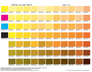
The Pantone Chart downloadable from this page provides the nearest CMYK colour value needed to create the Pantone colour.
Should you have any queries about designing your artwork or need some help or assistance, please feel free to contact me on 01785 224055 and I will be happy to help.
Kind regards
Heather
Printdesigns Designer
