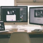
While we have offered some design tips previously, such as this blog outlining some methods to create a great pop up stand, now that our expert was back we thought that we’d take a moment to quiz her for our next informative blog post!
So – if you want to design your own exhibition stand or pop up stand, here are some crucial tips from our very own graphic designer.
What software do you recommend for designing banner stand graphics?
If you have access to them, I would always recommend using Adobe design programs such as Illustrator, InDesign and Photoshop. They are definitely the industry leaders for creating design for print and allow full creativity. However, if access to these programs is not available, then many designs can also be created in programmes such as Microsoft Publisher. But beware - the page size is limited, so if you need to create a really large design for an exhibition, you may be need to consider other options. It is also more limited in effects and colours than the Adobe packages.
How do you know how big to make the document?
The size of your document depends on which product your design is for. If you find your product on our website Printdesigns.com then you should find the document page sizes listed there, and in most cases there are downloadable data sheets and PDF templates to be used in Adobe Illustrator. If the page size is above the program page size limit, then we accept artwork scaled down to 50%.
What rules do we need to keep in mind when designing an exhibition stand?
The most basic rule is to keep it simple and to the point. This will make the design more striking and therefore more noticeable. If you add too much information to the design then it will become too busy and cluttered. This will make it harder for the viewer to quickly see the key points you are advertising, and they will carry on walking past.
What must we include?
Include the key points;
- Your logo
- A heading/strapline to draw the viewer in and tell them what you're advertising
- A few bullet points or small paragraphs with more information (optional)
- Striking imagery (if you have striking, high quality photos available, use them! Photos will always catch someone's eye more than words!)
- Contact details (phone number/web address)
What should be leave out?
Anything that is not essential! Keep the content to a minimum, if it doesn't need to be on there, don't clutter up the design with unnecessary words or images. Often any extra information can be passed on to the viewer in the form of a brochure or flyer, once the exhibition stand has drawn them in.
Should all banner stands have an image, or can text work too?
I would always recommend using imagery where possible, as images usually make the design stand out and more attractive. It is possible to make a text only design attractive and striking with the right colours, fonts and layout, but when the stand is stood next to one with a large bright image, it will be difficult to compete for the viewers’ attention
Are there any fonts we should avoid?
There are many fonts that are heavily used in the office environment, readily available in word processing packages, often for adding to office notices alongside clipart images. These fonts are over used and are often quirky and look cheap or unprofessional when used on a professional design. The main culprit for this is Comic Sans, the designers nightmare! The fonts used are very important to the over all look and feel of a design and should be considered carefully!
If we do use an image, what size should it be?
This really depends on what size the image will be on the finished design, whether it is a feature image, or a full background. But the image needs to be as large as available from the original photo source. An image can always be scaled down easily, but when scaled up it will lose quality and definition, so the larger the original the better!
Is there a secret when choosing which colours to use?
The colours should be kept in-keeping with your company brand. Many companies have 'branding guidelines' which dictate which colours should be used as the primary and secondary colour pallets. This will keep the design uniform and easily recognisable as your brand. We ask that all artwork is submitted in CMYK colour mode please.
What do we need to know when exporting/saving artwork?
When saving the artwork, save it as the highest quality option available, depending on which program you are using this may be listed as 'No compression' or 'Press quality'. Add bleed and crop marks where possible so that we can print and trim it accurately and provide you a with a stunning high quality print!
If you’re about to create your own banner stand design, we hope that this post has given you some useful tips and ideas. However, if you’re still not sure, not knowing your bleed from your crop or your Illustrator from your InDesign, then Heather can happily create your artwork for you!
For our premium graphic design service, contact Heather directly at: [email protected].
