Although classic and conventional most certainly has its place, breaking with convention can really pay off as some of these weird, whacky and wonderful exhibition booths and stands demonstrate. With a focus on standing out and drawing away from the rest of the pack, these unique and innovative - potentially risk-taking designs - reveal that doing it differently can work wonders!
Cadbury
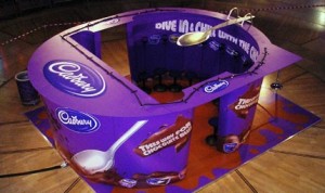
Although a highly esteemed and deeply secured brand, Cadbury knows how to rock the boat with a little innovation. Everyone notices the imperial purple and tantalising chocolate brown colour scheme that emblazons Cadbury’s products. This highly unique exhibition stand literally looks scrumptious, making a valuable connection between the divine tastiness and appealing aesthetic of the brand.
With high visual appeal, this stand really encourages people to come by, looking exactly like an enlarged Cadbury pot complete with a spoon that seems to double as a diving board! It’s a little weird and a little whacky, but does it grab your attention? Certainly!
[Image source: http://www.orphicpixel.com/10-examples-of-weird-and-wonderful-exhibition-stands/]
Sheila’s Wheels
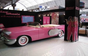
When you want people to come on over, colour is key. The Sheila’s Wheels colour scheme is bold, vibrant and dramatic and appeals to a very clear demographic. Everything from the font, the images of three Charlie’s Angels-esque front women and of course, that car helps target the key audience of sassy women who want things their way.
Making it clear who your audience is from a distance is a great way to draw an intrigued crowd. Even if people have never heard of you, they immediately feel enticed over because they feel that your stand has something to offer. Utilising the space to make it a place of their own, they went a little above board, but we are sure it paid off.
[Image source: http://www.orphicpixel.com/10-examples-of-weird-and-wonderful-exhibition-stands/]
Rima Darwash
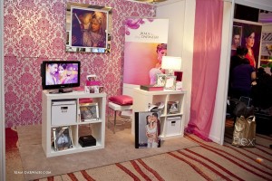
As specialists in Asian Bridal photography, this stand again looks wonderful whilst making a strong visual statement about who they are and what they do. You don’t need to read any text or ask any questions to see who the intended demographic is or what they are selling. As such, exhibitors don’t need to go searching for people to attend their stand, people flock to them. The beautifully intricate colour scheme oozes warm femininity whilst the images and video footage reveal some of Rima’s best works.
[Image source: http://rimadarwash.com/page/26/ ]
Nokia
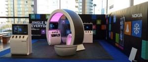
Quirky always captures the eye. Making a strong visual impact that reveals a lot about who you are and what you do, whilst also being a bit ‘out there’ can really draw in a crowd. Of course, as an established brand, Nokia is probably happier to take risks. Newer businesses can also benefit from going all out at their first exhibition to make waves as soon as they get into the sea! This highly unique design mirrors Nokia’s merchandise looking like a large pair of headphones. Incorporating your products into your overall design is a highly artful and eye catching way to get people coming over, whilst also advertising your wares.
[Image source: http://www.orphicpixel.com/10-examples-of-weird-and-wonderful-exhibition-stands/]


